
How much time do we spend on making the web more accessible? And how much on supporting outdated browsers like IE? The chances are that more of our visitors would likely benefit from improvements in the accessibility area, but they are invisible to our statistics and error reporting.
Nonetheless, by today's post on this matter, I want to show you that it's not, in fact, that complicated to improve the audience's experience.
We're going to look at forms specifically, using the awesome Orbit component library in code examples, but all rules mentioned here apply in general.
Who is accessibility for?
Before we start with an example, defining what we understand under the term accessibility is essential. The truth is that many developers and product owners put an equation between accessibility and blindness difficulties, treating this topic as a "nice to have" feature which can wait.
But accessibility is not just how the screen reader interprets the web content.
We can split various impairments into categories as follows:
visual - e.g. full, partial, or color blindness, photosensitive seizures, astigmatism
Even in the strict interpretation, we can't treat accessibility only as a way of making web page more screen reader friendly. Such a tool will probably be used only by people with the most severe eyesight problems, while chosen colors and font matters to others.
motoric-coordination difficulties
Some visitors, especially at higher age or with lasting injury, can get stuck on elements that move too fast, shift their position, or don't work with a keyboard and require precise mouse navigation.
You should keep in mind many aspects: foremost, you should observe Cumulative Layout Shift (CLS) metric from web vitals on your web as buttons that jump from their position just before tapping them irritates everybody. Also, enabling the selection of items from autocomplete and dropdown using keyboard only is hardly a mistake.
And last but not least, a significant improvement happens even with something as small as putting an authorization code at the beginning of SMS instead of its end. All users appreciate it if they have such information available right on the lock screen instead of doing extra steps with a mobile phone because the text in the notification was truncated.
cognitive limitations
Line-height, font size, or paragraph length are all things that determine how well people, for example, with dyslexia, may understand the content. Communicate information through illustrations, not only by text, to ease out understanding.
As you can see now, accessibility spans multiple areas and can be perceived more like a UX extension. And with this being said, we shall acknowledge that it's not some nitpicking but a problem that actually affects a significant portion of our audience.
The good thing is that it's possible to improve the overall experience a lot with just a few fundamentals in mind. And it includes developers themselves, as you will see at the end.
Importance of form element
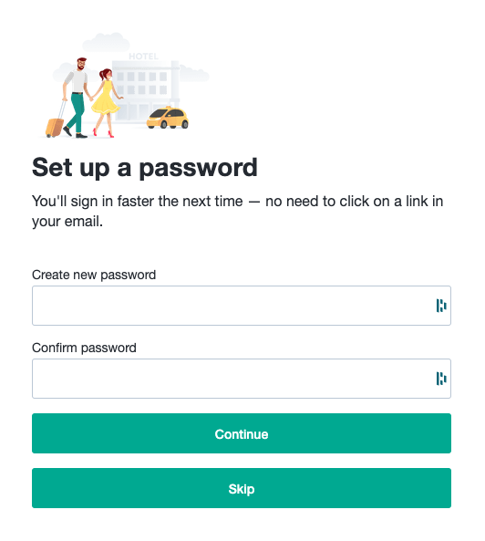
Let's now look at the form where users set their new password, or they're able to skip such a step entirely when authenticating for the first time.
A simplified implementation that uses Orbit components could look more or less as follows:
const SetPassword = ({ onSubmit, onSkip }: Props) => {
  return (
    <Modal size="small">
      <ModalHeader />
      <ModalSection>
        <Stack>
          <InputField type="password" label="Create new password" />
          <InputField type="password" label="Confirm password" />
          <Button type="primary" fullWidth onClick={onSubmit}>
            Continue
          </Button>
          <Button type="primary" fullWidth onClick={onSkip}>
            Skip
          </Button>
        </Stack>
      </ModalSection>
    </Modal>
  );
};
For sure, it's going to work, and we might put the task into the "done" column, yet we made a big mistake by omitting the form element.
A long time ago, all inputs had to be wrapped in <form /> to function correctly, but with the rise of single-page applications, actions are now usually handled by JavaScript, and it seems to be redundant and often forgotten. Form submit is then performed by an onClick callback attached to a specific button.
But as long as we leave out the <form /> tag, text input can't be submitted by the enter, and we also didn't specify what's the primary button if there are more.
Let's refactor the code now:
const SetPassword = ({ onSubmit, onSkip }: Props) => {
+  const handleSubmit = useCallback((e) => {
+      e.preventDefault();
+      onSubmit();
+    },
+    [onSubmit],
+  );


  return (

  <ModalSection>
+   <form onSubmit={handleSubmit}>

-            <Button type="primary" fullWidth onClick={onSubmit}>
+            <Button type="primary" fullWidth submit>


+   </form>
With such a simple change, we've made our form submittable by the enter, and assistive technologies will better understand its context.
Progressive disclosure
We've improved the keyboard experience, but let's revisit the visual side - our form has two primary buttons. That means they compete with each other over the user's attention. And as various psychological studies proved it, every person has the limited brain capacity to perform many little decisions during the day. In other words, we shouldn't make people think about our interface. Otherwise, they might get overwhelmed and eventually bounce out of the web.
There are several solutions: we could choose only one of the buttons as primary (if it has lesser importance) or make both of them subtle:

We got it by switching button type from "primary" to "primarySubtle":
<Button submit type="primarySubtle" fullWidth>Continue</Button>
Alternatively, we could show only information relevant at the time:
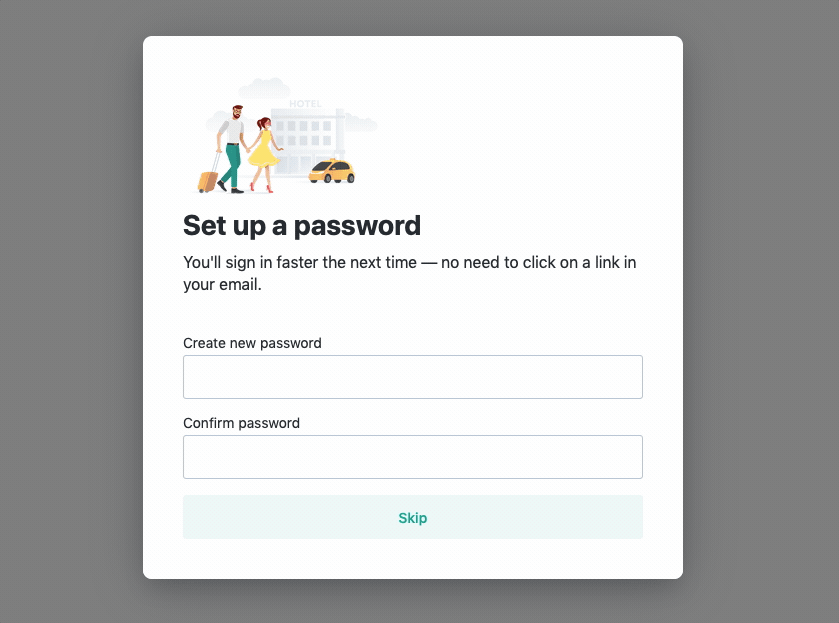
At first, the subtle "Skip" button is shown, but right after we start filling the form, we replace it with the submit "Continue" button.
This approach is called progressive disclosure. To illustrate it in a more representative example, consider a shopping cart where users have to select shipment and payment methods. Instead of overwhelming them with the matrix of all possible options, you can, for example, display and preselect a single variant and offer other methods from an expandable list that is hidden by default.
Better mobile phone experience
Let's now suppose that we ask for a security code of credit card in our application, a 3-digit verification number. No other characters are involved. Yet what type of keyboard we usually display to the user on mobile devices?
We could potentially switch input type to "number", but this is still too suboptimal. Although keyboards containing numbers are shown, most of the valuable space on IOS is still occupied by special characters:
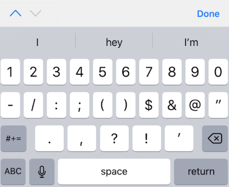
On top of that, we got native decrement and increment buttons inside the input, which do not make sense there.
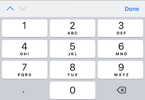
There is a better way. If we set inputmode="decimal" on the input element, we get exactly what we expect:
And as a cherry on the top, we can reward those who responsibly rely on password managers. By adding autocomplete="cc-csc" parameter, we help autocomplete tools of password managers recognize the true meaning of the field, so they make the right suggestions.
Check out the awesome talk by Alex Holachek and her demo app to learn more about autocomplete and input mode options.
Buttons with no label
Nice, we've made a significant improvement! But before we wrap up the topic of accessibility, let's check buttons. If they contain text label, we're good to go, but what if we have a search bar that looks like this:

The meaning is clear for most of us, not so for people with visual impairment since the button label consists solely of an SVG icon. Users relying on a screen reader will hear just a "button".
Fortunately, all that we have to do is to use "aria-label" properly in such cases:
const SearchBar = () => (
  <Stack direction="row" spacing="XXSmall">
    <InputField />
    <Button iconLeft={<Search ariaLabel="Search" />} />
  </Stack>
);
As you can see, it's not that a hassle to improve the experience, even for screen readers.
Bonus: testing
There is an additional hidden secret known only to developers who responsibly test their code: accessibility affects unit and E2E tests. Just like some visitors can't see your content on the page, we can't effectively identify elements to select them if any "anchor" is missing.
If you are using @testing-library, think about how you would select a button with a search icon only from the previous example if there are many buttons like that. With aria-label, the button becomes accessible even in your tests:
const { getByLabelText } = render(<SearchBar />);

expect(getByLabelText("Search")).toBeInTheDocument();